|
|
Post by Caramel on May 21, 2011 12:58:41 GMT
Does what it says on the tin. Anything you think needs tweaking, (colours, settings, fonts, etc.) if its doable and no one has too strong an objection... Plus we've got rankings when you reach a certain number of posts to sort out.  |
|
|
|
Post by sophiechiefs on May 21, 2011 14:10:33 GMT
I think it is fab!
I don't mind about fonts/colours, I like blue. =)
|
|
|
|
Post by gemstone on May 21, 2011 15:49:40 GMT
its Very Nice Blue |
|
|
|
Post by Caramel on May 21, 2011 16:13:24 GMT
I though it was a bit of a bland blue! Less scary than the yellow though. Can make background, fonts, headings etc. any of these:  |
|
|
|
Post by ModernWay on May 21, 2011 20:56:49 GMT
I like it if not just change the blue slightly. But i'm not fussed aslong as it's not pink ;P |
|
|
|
Post by tanja78 on May 23, 2011 11:02:03 GMT
Looks really nice Caramel and bunch of thanks for starting a new forum!
|
|
|
|
Post by noamjen on May 23, 2011 12:27:38 GMT
I also dig the colour combination! (Blau und Weiss ein leben lang!!!!! ;)
Thought if you end up changing it, please not yellow. That colour literally hurts my eyes...
|
|
|
|
Post by modflower on May 26, 2011 11:00:37 GMT
For the backround, can you do a pattern or photo, or are you only limited to the colour grid? I actually had an idea for something "vintage Chiefs" if you can do patterns ("Employment" album backround, or something stripey,) but I don't know now. Maybe too "been there, done that?" How about something that looks like Little Shocks?  |
|
|
|
Post by Caramel on May 26, 2011 11:05:11 GMT
We can have an image as a background. If someone wants to make something... Also, the photo at the top of the page is just one of mine from the Wembley Arena gig. I'm sure we could come up with something better. Maybe ask Ricky to do us a logo!  |
|
|
|
Post by modflower on May 26, 2011 11:21:27 GMT
Ooh, a logo from Ricky would be cool, if he'd do it!  I just thought, maybe there could be two photos up top, since there seems to be plenty of room. Like on the left side, use an old photo of the band, and on the right, something more recent. |
|
Lala
Powered Up Pacman

Posts: 158
|
Post by Lala on May 26, 2011 11:44:03 GMT
Just wanted to say thanks for doing this, Caramel. Blue is not my fave colour but I really don't mind. I guess I just have to get used to it. I like the idea of Ricky doing us a logo. |
|
|
|
Post by Caramel on May 26, 2011 11:58:05 GMT
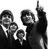
I just thought, maybe there could be two photos up top, since there seems to be plenty of room. Like on the left side, use an old photo of the band, and on the right, something more recent. There's just one URL link spot for the picture up top. You could amalgamate two pictures, just as long as they've got one link. I'll give it a go. See what happens. Edit: Oohh it worked! I just grabbed one of the old photos though so I need suggestions for a better one. |
|
|
|
Post by modflower on May 27, 2011 5:24:16 GMT
That looks good! Kaiser Chiefs - 'then' and 'now.' |
|
Dani86
Imaginary Dynamo

Posts: 315
|
Post by Dani86 on May 27, 2011 17:17:51 GMT
I could fiddle around on photoshop and make an (oldschool) banner. As for the background, I don't know about others, this blue hurts my eyes a little on my comp |
|
Tanya
Powered Up Pacman
good bad right wrong
Posts: 152
|
Post by Tanya on May 27, 2011 21:14:08 GMT
Those pics look too big and i agree about the blue colour... it's too bright for my eyes. Unfortunately i totally suck at designing, but it would be great if other people (who know all that kind of stuff) work on the forum designing. Anyway, thanks for making this forum Caramel |
|
Dani86
Imaginary Dynamo
Posts: 315
|
Post by Dani86 on May 27, 2011 21:32:38 GMT
had a quick fiddle with my old friend photoshop   if it needs changing, just let me know |
|
Tanya
Powered Up Pacman
good bad right wrong
Posts: 152
|
Post by Tanya on May 27, 2011 21:35:49 GMT
i like the 1st one
|
|
Dani86
Imaginary Dynamo
Posts: 315
|
Post by Dani86 on May 27, 2011 21:40:32 GMT
thank you also found this |
|
|
|
Post by schmimblebob on May 27, 2011 23:13:11 GMT
Swear filter? I only noticed this after I swore in one of my posts  Also love the banners Dani  Is it possible to align it in the middle at the top cos at the moment it runs from the left hand side and to me its not "aesthetically pleasing"(one of my old lecturers always banged on about this - becoming a radiographer has made me super pernickity ) |
|
|
|
Post by modflower on May 28, 2011 4:01:57 GMT
I too love the banners, Dani. I like the photo in the 2nd one because it's lighter. And yes, it should be centered up top. I also really like the backround wallpaper Dani found. (Should probably remove the "Employment" label , though.) The wallpaper adds a touch of vintage Chiefs.
Don't know why I'm so interested in an 'Old-Chiefs/New Chiefs' theme. I must be feeling nostalgic.
|
|
|
|
Post by Caramel on May 28, 2011 4:35:10 GMT
Unfortunately I can't centre the banner. Cheers for having a fiddle Dani. |
|
Dani86
Imaginary Dynamo
Posts: 315
|
Post by Dani86 on May 28, 2011 8:24:14 GMT
it's still the old banner atm, is it? cause i can see the 'old' one i can adjust the size of the banner so it's automatically center, if someone gives me the correct sizes |
|
|
|
Post by sophiechiefs on May 28, 2011 9:13:54 GMT
Yeah its still the old one. I like the 1st photo Dani. I love the new background too! It's looking good! Edit: The new one flashed up once on the profile bit. |
|
schatzi
Powered Up Pacman
Posts: 117
|
Post by schatzi on May 28, 2011 9:53:16 GMT
I like the new background, it's much better than the blue one. |
|
sheeny
Fly On The Wall
Posts: 9
|
Post by sheeny on May 28, 2011 18:53:55 GMT
I like this new background and the picture.
This is a bit like moving house and redecorating!
|
|
Blonde
Riot Predicter
Posts: 79 
|
Post by Blonde on May 28, 2011 18:57:06 GMT
I'm not so keen on the background, it looks a bit old ladyish to me
|
|
Emmererr
Fly On The Wall
Going Backwards...
Posts: 13
|
Post by Emmererr on May 29, 2011 14:39:44 GMT
A few people have professed a liking for the old plaid background that the forum had once upon a time, is there any way we could use that background or emulate it in some way?
|
|
Lala
Powered Up Pacman
Posts: 158
|
Post by Lala on May 30, 2011 10:00:05 GMT
Nice one, I like the banner and the new background. |
|
|
|
Post by schmimblebob on May 30, 2011 17:06:04 GMT
The new background's great. I think because of the size of the banner the top of the page automatically looks better spaced too |
|
Tanya
Powered Up Pacman
good bad right wrong
Posts: 152
|
Post by Tanya on May 31, 2011 7:06:56 GMT
i think there's a few people who would definitely agree with me... we need MORE smileys! |
|


 Is it possible to align it in the middle at the top cos at the moment it runs from the left hand side and to me its not "aesthetically pleasing"(one of my old lecturers always banged on about this - becoming a radiographer has made me super pernickity